Pepsi Stuff
Overview
Launched in January 2018, Pepsi Stuff was a loyalty program that let Pepsi fans earn points towards exclusive rewards. The program was a responsive website powered by CrowdTwist technology, which allowed members to scan Pepsi receipts for points in order to redeem rewards. Pepsi Stuff featured a nostalgic look and feel that was reminiscent of the original Pepsi Stuff campaign from the 1990s.
My role on this project was to design the information architecture and wireframes for the program, providing expertise on how to best use CrowdTwist technology. In addition, I used the client-supplied style guide and applied it to all pages within the program as I designed the UI.
Role
Lead UI/UX Designer
Responsibilities
- Audience research
- Information Architecture
- UX design
- UI design
Research & Wireframes
In my research for this project, I found that the target audience for this program was the hardcore Pepsi fan who lived and breathed the brand. Many of these fans remember the classic Pepsi Stuff campaign from the mid 90s, and the client wanted to have a similar style for the updated version.
My research showed that the audience would likely be split fairly evenly between desktop and mobile users, so I put equal priority on each as I designed the program. I checked in with our front-end developer regularly throughout the process to make sure that each section of each page would look and work well on both desktop and mobile.
In addition, the client wanted a simple, streamlined program where the branded rewards were the main attraction. I took this into account when designing wireframes for the client.
I put together a set of wireframes showing four main pages: Home, Rewards, Profile, and FAQ:
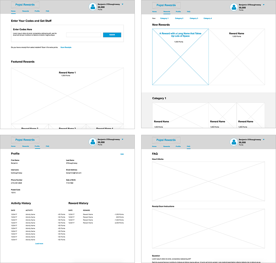
Select wireframes for each main page of the program.
Product Screenshots
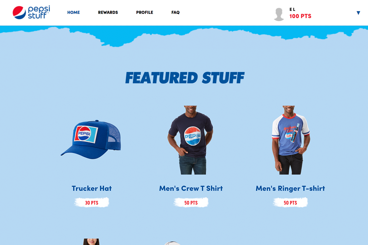
A sample of rewards
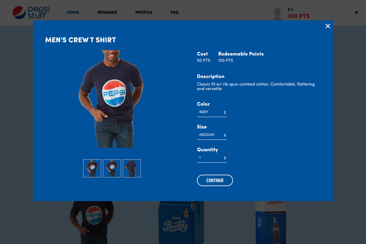
Reward detail modal
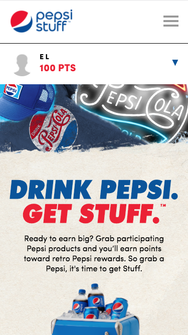
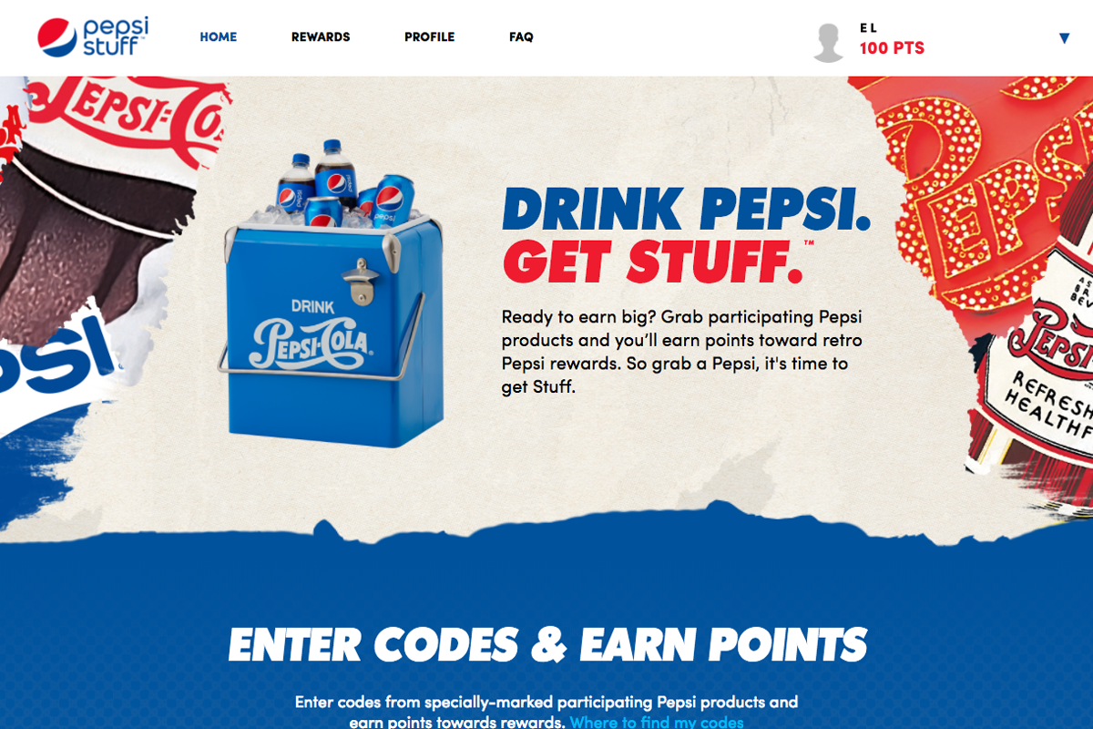
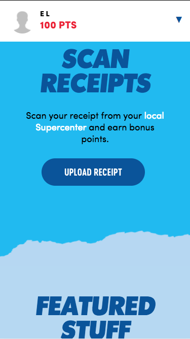
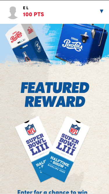
Home page
Home page continued
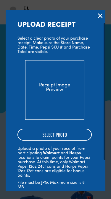
Upload receipt modal
Rewards page
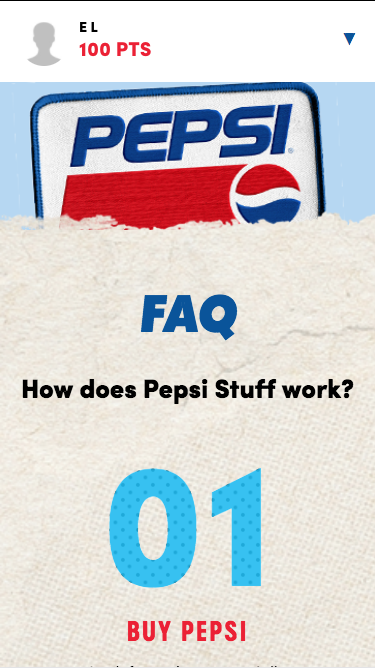
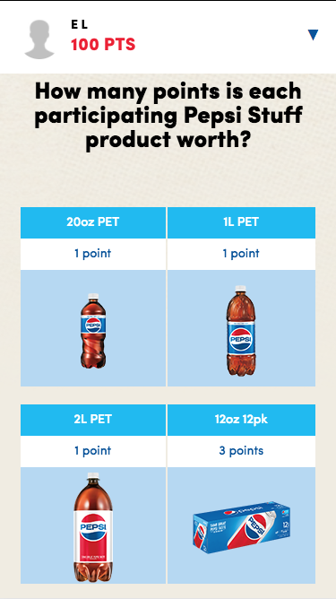
FAQ page
FAQ page continued
Challenges
Pushing the limits of CrowdTwist technology to achieve the client's desired creative direction
The client had a specific look and feel in mind for the program, with plenty of torn textures, overlapping layers, and distressed backgrounds. In the backgrounds, they wanted a mixture of nostalgic brand imagery and actual program rewards. These factors added up to the most ambitious look and feel to implement using CrowdTwist technology to date. I had to consider how each element on screen would be coded. For example, I tried out various techniques with our front-end developer to figure out how to achieve this torn paper look in conjunction with the pattern underneath:
Applying the unique aesthetic across different breakpoints
Keeping the aesthetic consistent across different breakpoints proved challenging, as we had to make each element shift and scale along with the viewport. This task was further complicated by the number of different layers and torn images in the design. I worked closely with our front-end developer to make sure each section of each page displayed properly, regardless of the screen size.